Magazine Overview
AMP is the official opinion and satire magazine of the University of Texas at Dallas. Founded in the early 2000s, this publication provides a platform for various student voices. Since then, AMP has expanded beyond text-only articles into a diverse array of multimedia posts in both print and digital formats. With this diversifying in content also came a need for a more robust design department, which I helped strengthen over my tenure at AMP.
Art Direction
From 2018-2019, I served as Art Director for this magazine, overseeing the publication of 12 issues and hundreds of pages of content. Helming a team of artists, photographers, and designers, I provided guidance and feedback to produce the best content possible. Additionally, I engaged in editorial duties ranging from coordinating design and writing team meetings to migrating the magazine’s communication and file systems to a modern standard. Previously, members communicated via Facebook and used a patchwork system of linked google drive files to store spreads, but I moved communication to a structured Slack group and file storage to a larger Box system, enabling proper version control and updates.
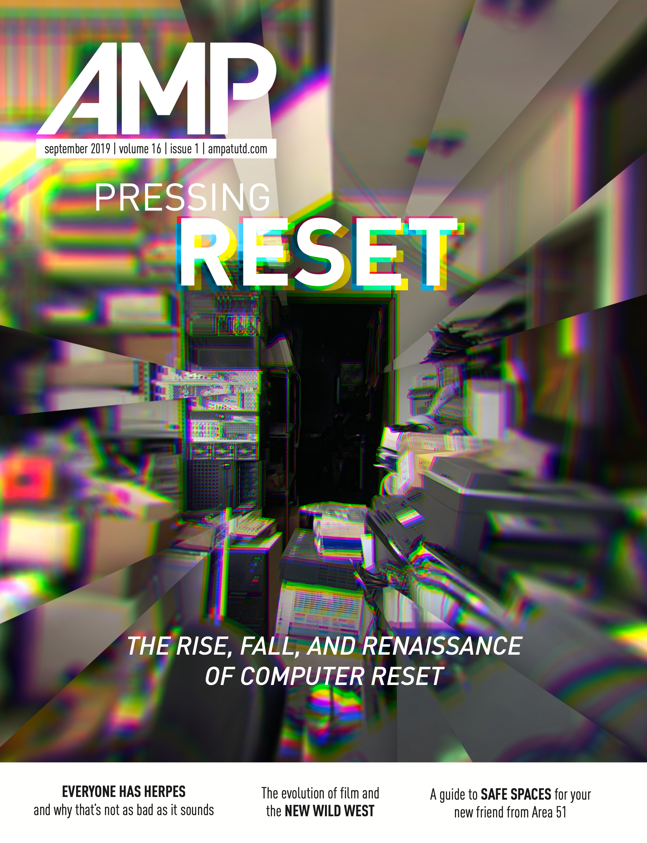
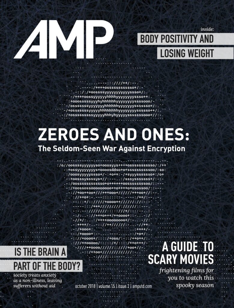
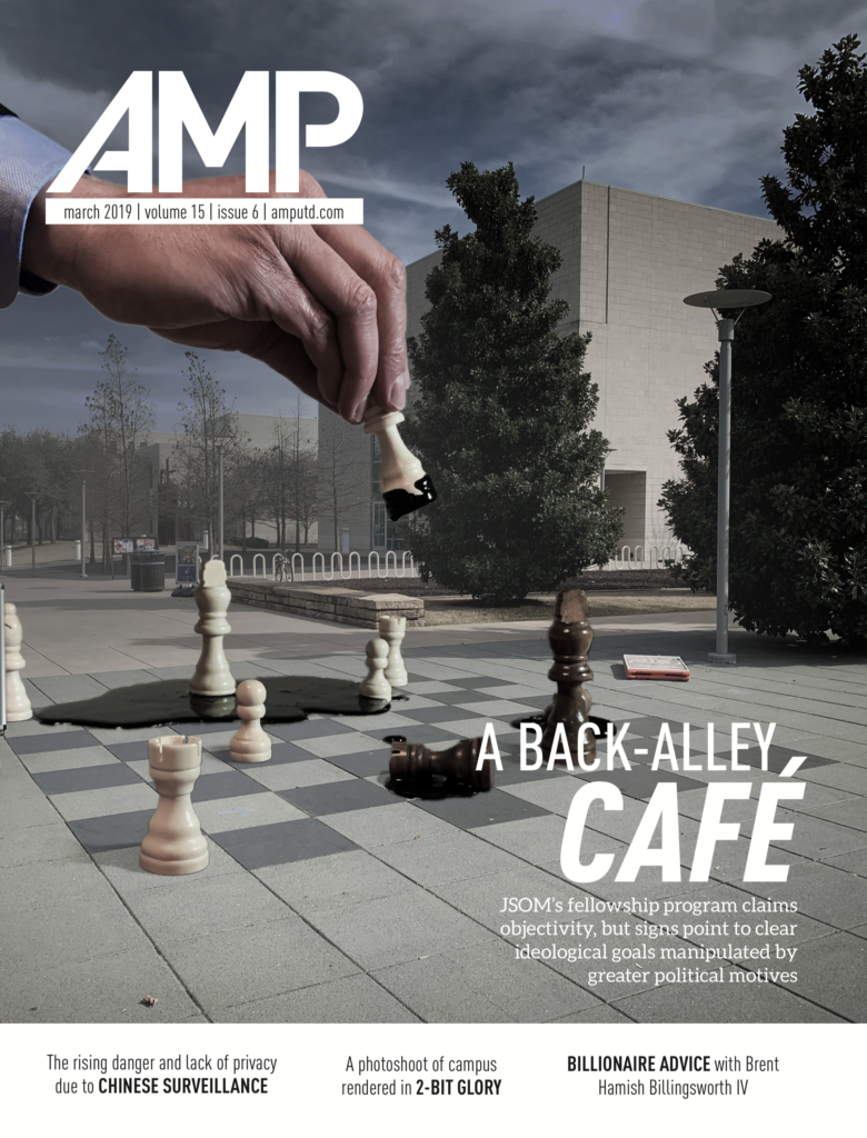
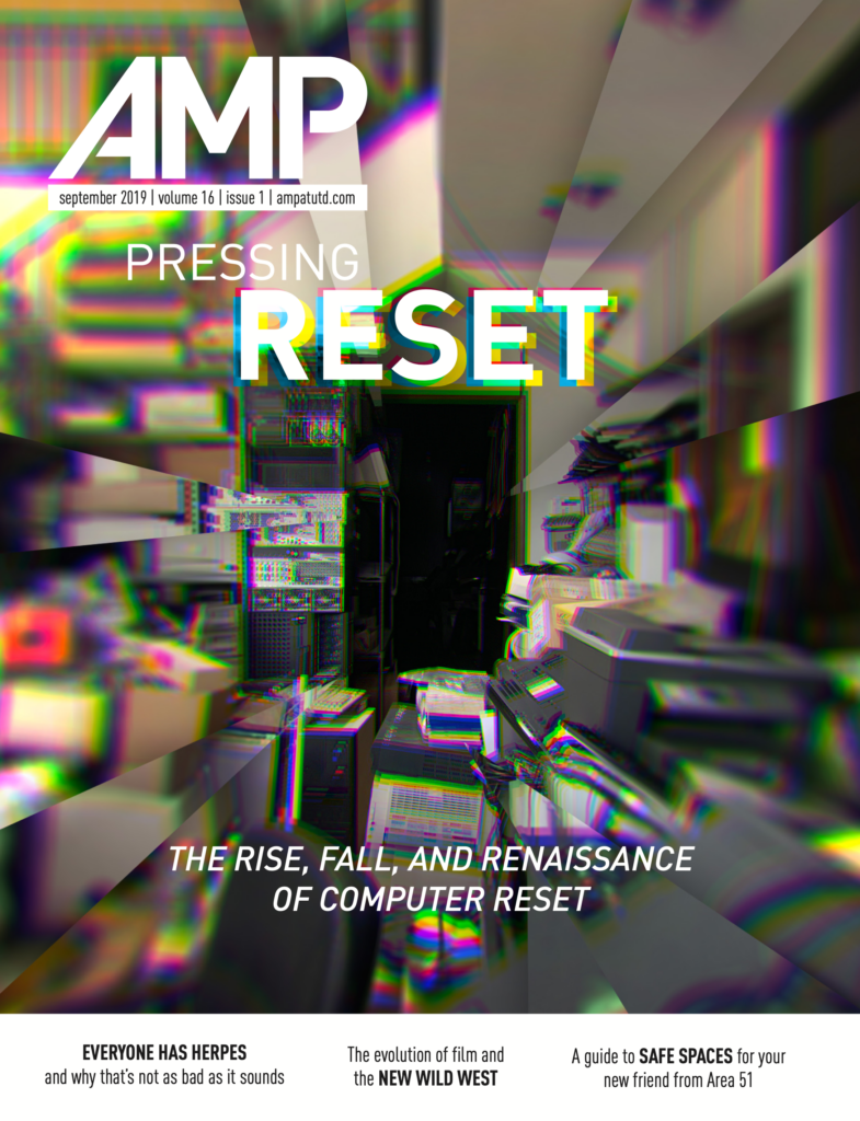
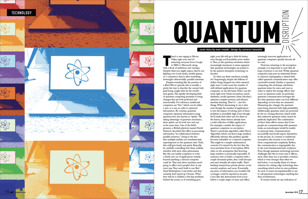
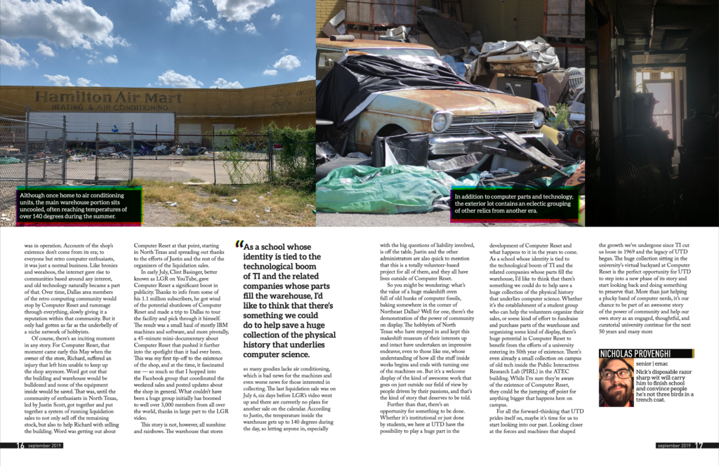
Beyond these managerial tasks, I also engaged in design myself, overseeing 12 cover spreads and dozens of other featured articles throughout my tenure. An example of some of the work can be found below.
Style Guide
One of the final projects from my tenure was a comprehensive design guide coupled with several templates for future designers to use. Additionally, I helped to create a ground-up rework of the magazine’s design, helping to establish styling guidelines that are still in use today.
One of the biggest goals of this redesign was to help establish brand cohesion and simplify the existing layout. Previously, there were no existing templates for designers to utilize, and much of the varied fonts and colors used led to an inconsistent look and feel across spreads. Under the new guidelines, fonts, spacing, and contrast were all codified, ensuring that even with drastically different design treatments, the magazine would still retain a cohesive feel. Additionally, I brought special attention to text-heavy areas such as the table of contents, incorporating more graphics in these areas to help bring visual interest from cover to cover. A full copy of the design guidelines can be found linked here.